-
Why Every Office Door in City Hall Must Have Raised Lettering and Braille: ADA Signage Requirements for Municipal Public Buildings
A Guide for Advocates and Citizens Who Are Blind or Visually Impaired
More Than a Legal Checkbox
Imagine arriving at your city’s municipal building to pay a utility bill, apply for a permit, or attend City Council meetings and having no way to know which door leads where. No readable signs. No way to distinguish the Tax Assessor’s office from the City Clerk’s office from a utility closet.
For the more than 7.6 million Americans living with visual disabilities, this is not a hypothetical scenario. It is every day.
The Americans with Disabilities Act (ADA) established federal standards for accessible signage in public buildings, standards that many municipalities still fail to meet. This post breaks down exactly what the law requires, why it matters, and why raised lettering and Braille at every office door isn’t just a legal obligation, it is a basic act of respect and dignity.
What the ADA Says About Signage
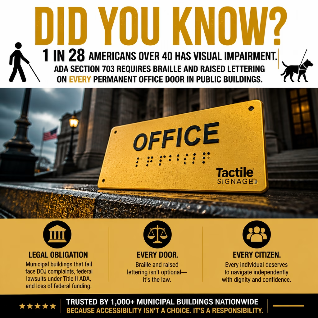
The ADA Standards for Accessible Design, specifically Section 703, establishes requirements for signs in public facilities. These requirements apply directly to city and county municipal buildings, including courthouses, city halls, permit offices, public health departments, libraries, and more.
Signs That Must Have Raised Characters and Braille
Under ADA standards, any sign that identifies a permanent room or space must include:
- Raised (tactile) characters — letters and numbers that project at least 1/32 inch from the sign’s surface
- Grade 2 Braille — the contracted form of Braille used by most Braille readers
- Both uppercase and lowercase letters — raised characters must use uppercase letters only, but visual characters on the same sign may use mixed case
This requirement applies to every permanent room in a municipal building, including:
- Individual office doors (City Clerk, Tax Assessor, Building Permits, etc.)
- Conference rooms
- Restrooms
- Stairwells and exit doors
- Storage and utility rooms accessible to the public
- Elevator lobbies and floors
Placement Requirements
The ADA is specific about where tactile signs must be mounted:
- On the wall on the latch side of the door — the side where the door handle is located
- Centerline between 48 and 60 inches from the finished floor, placing the Braille and raised characters within reach of most adults and wheelchair users.
- At least 18 inches from the nearest corner, ensuring a person can approach without bumping into the door as it swings open
This placement is not arbitrary. It allows a blind or visually impaired person to locate the sign predictably, approach safely, and read it with their fingertips without guessing where to reach.
Character and Braille Specifications
- Raised characters must be between 5/8 inch and 2 inches in height
- Characters must have a sans-serif font (no decorative serifs that complicate tactile reading)
- There must be a non-glare finish on the sign surface
- Characters must contrast visually with the sign background (for those with low vision)
- Braille dots must follow specific dome height and spacing requirements per ANSI/ICC A117.1 standards
Why Municipal Buildings Must Do Better: 10 Reasons Braille and Raised Lettering Matter
1. Independence Is a Civil Right
The ADA was signed into law in 1990 with a foundational principle: people with disabilities have the right to participate fully in civic life. A blind resident cannot independently navigate a city building without tactile signage. Dependence on sighted assistance for something as basic as finding an office strips away autonomy that every citizen deserves.
2. Municipal Buildings Serve Everyone, Including Blind Taxpayers
City halls, county courthouses, and public service offices exist to serve all residents. Blind and visually impaired citizens pay the same taxes, hold the same rights, and require the same services as sighted residents. Accessible signage is not a special accommodation, it is equal service.
3. Visual Impairment Is More Common Than Most Realize
According to the CDC, approximately 1 in 28 Americans over age 40 has some form of visual impairment. Age-related vision loss, macular degeneration, glaucoma, diabetic retinopathy — means that the population of people who benefit from tactile signage grows every year. Seniors accessing Medicare offices, veteran services, or property tax assistance are disproportionately affected.
4. Low Vision ≠ No Vision: High-Contrast Signage Helps Too
Not everyone who benefits from accessible signage is completely blind. People with low vision, those who cannot read standard print even with glasses benefit enormously from high-contrast visual signs combined with tactile elements. The ADA’s signage standards address both populations simultaneously.
5. Braille Literacy Is a Lifeline, Not a Relic
Some assume that audio technology has replaced Braille. It has not. Studies consistently show that Braille readers have significantly higher employment rates and literacy levels than blind individuals who do not read Braille. Providing Braille signage validates and supports Braille literacy and acknowledges that technology (phones, screen readers) should supplement, not replace, physical accessibility.
6. Tactile Signs Enable Quiet, Private Navigation
Relying on a phone’s GPS or asking a stranger for help every time you approach a door is not a dignified or feasible. Tactile signage allows a blind person to navigate confidently and quietly without announcing their destination to everyone nearby, which matters especially in sensitive settings like public health offices, legal aid, or social services.
7. Consistent Signage Reduces Anxiety and Increases Confidence
For individuals navigating a new or unfamiliar building, predictability is everything. When tactile signs are consistently placed on the latch side of every door at the same height, a blind person can build a mental map of the space efficiently. Inconsistent or missing signage creates frustration, confusion, and safety risks.
8. It Protects the Municipality from Legal Liability
Municipalities that fail to meet ADA signage standards are subject to:
- Complaints to the U.S. Department of Justice
- Civil lawsuits under Title II of the ADA, which applies directly to state and local government entities
- Loss of federal funding, cities receiving federal grants must comply with Section 504 of the Rehabilitation Act, which has parallel accessibility requirements
Proactive compliance is far less costly than litigation, settlements, or federal audits.
9. It Sets a Standard for the Entire Community
When a city hall models full ADA compliance, it sends a message to local businesses, schools, and organizations. Municipal buildings are civic anchors, what they do (or fail to do) shapes community norms around accessibility. Leading by example has a ripple effect throughout the entire community.
10. People Are Waiting
Every day that a municipal building operates without compliant tactile signage is another day that a blind resident cannot find the Building Permits office independently or attend those City Council meetings. Another day someone must ask for help to find a restroom. Another day a veteran cannot locate the VA liaison’s door without assistance. The harm is not theoretical, it is ongoing reality.
Common Violations to Watch For in Municipal Buildings
If you are an accessibility advocate, a blind resident, or a city official conducting an audit, here are the most frequent ADA signage violations found in municipal buildings:
- Signs mounted on the door itself rather than the adjacent wall
- Signs placed too high or too low — outside the 48–60 inch centerline range
- Pictogram-only signs without accompanying raised text and Braille
- Braille that is incorrect or outdated — some older signs use Grade 1 Braille, which does not meet current standards
- Glare-producing sign finishes that reduce legibility for low-vision users
- Insufficient contrast between characters and sign background
- Temporary or paper signs substituting for permanent tactile signs
- Missing signs on rooms that have been repurposed without updating signage
What Advocates and Residents Can Do
File a Complaint
Anyone can file an ADA Title II complaint with the U.S. Department of Justice Civil Rights Division at www.ada.gov or call 1-800-514-0301 (Voice) / 1-800-514-0383 (TTY).
Request a Self-Evaluation
Under ADA Title II, local governments are required to conduct a self-evaluation of their programs and facilities. Residents can formally request that a city conduct or update its self-evaluation and transition plan.
Connect With Your State’s Protection & Advocacy Organization
Every state has a federally funded Protection & Advocacy (P&A) organization that provides free legal assistance to people with disabilities. They can help you navigate complaints or advocate for systemic change.
Attend City Council Meetings
Accessibility issues in public buildings are legitimate policy concerns. Showing up to public comment periods and city council meetings puts pressure on elected officials to allocate budget for ADA compliance upgrades.
Conclusion: Braille on Every Door Is Not Too Much to Ask
A small tactile sign, a few raised letters, a line of Braille dots, costs very little. What it provides is immeasurable: the ability to move through a public building independently, privately, and with confidence.
Municipal buildings belong to everyone. The blind resident who needs to renew a license, attend a hearing, or access public records deserves the same frictionless experience as any sighted visitor. Raised lettering and Braille signage at every office door is not a luxury upgrade. It is not only the Law but also the right thing to do.
-
Understanding ADA Compliance vs. Accessibility
When people talk about the Americans with Disabilities Act (ADA), they often assume that “compliant” automatically means “accessible.” It doesn’t. In fact, the gap between those two ideas is where many disabled people run into the most frustrating and sometimes dangerous experiences.
ADA compliance is about meeting the minimum legal requirements. It’s a checklist: Are there braille room signs? Are doorways wide enough? Is there a ramp?
ADA accessibility, on the other hand, is about whether a space is actually usable in the real world by people with disabilities. It’s not just “Did you install the sign?”, it’s “Does this space work for someone navigating it independently?”.
That distinction might sound subtle, but in practice, it’s enormous.
A Real Experience: When Compliance Falls Short
Recently, I had to visit Norman Regional Hospital with my wife. She was dealing with some health issues, thankfully, she’s doing better now, but during the day and a half I spent there, I encountered a pattern that perfectly illustrates the difference between compliance and true accessibility.
In case you found this post through search and don’t know me: I’m blind. I have about two degrees of peripheral vision left, but what I see is so diffused it’s essentially a blur.
Throughout my stay, I asked staff where I could find things like vending machines. Every time, someone kindly offered to bring me food or a drink instead. I appreciated the help, but that wasn’t the point. I wanted the ability to navigate independently, to explore the space like anyone else.
At one point, I was even asked not to leave the room. It was framed as concern for my safety. And I understand that instinct, but it raises an important question: why is the environment so difficult to navigate that independence is discouraged?
That’s not accessibility. That’s containment.
Where the Hospital Got It Right—and Wrong
To be fair, the hospital did check some ADA boxes. There were braille signs on every room. That’s compliance.
But here’s where things broke down:
- There were no braille or raised-letter navigation signs to help someone move through hallways.
- The main entrance was massive and confusing, with no clear tactile or accessible guidance.
- I needed a family member to guide me back to my wife’s room after leaving the building.
- Worst of all, the braille on her room sign was wrong—off by one digit. I found another incorrect sign elsewhere.
This is the perfect example of compliance without usability. The signs existed, so technically a box may have been checked. But if the information is inaccurate or incomplete, it doesn’t just fail, it misleads.
That’s not accessibility. That’s a hazard.
Compliance Is the Floor, Not the Ceiling
The ADA, particularly through standards like ADA Title III and ADA Title II, lays out requirements for signage, navigation, and equal access. But laws can only go so far.
They define the minimum. They don’t guarantee a good experience.
True accessibility asks deeper questions:
- Can someone navigate the space without assistance?
- Is the information accurate and consistent?
- Are systems designed with real users in mind, not just regulations?
It’s Not Just Hospitals
A few days after my wife was discharged, we went to breakfast at Neighborhood Jam, one of her favorite spots because they offer gluten-free options.
After eating, I headed toward the restroom based on her directions.
And then I hit another wall: there were no restroom signs I could use.
No braille. No raised lettering. Just visual text on the door that I wouldn’t have known about had my wife not told me.
This is an area where ADA requirements are actually quite clear. Restrooms are supposed to be properly labeled. There have been lawsuits over exactly this issue. And yet, here we are.
What makes it more frustrating is how simple the fix is. A compliant braille sign can cost as little as $13. This isn’t a massive infrastructure overhaul. It’s a small, meaningful step that makes a space usable for more people.
The Bigger Picture
After we got home and my wife had time to rest from her hospital stay, I filed a complaint. I don’t know if anything will come of it, but staying silent guarantees nothing will change.
The truth is, most accessibility failures aren’t about bad intentions. The staff at the hospital were kind. The restaurant serves great food. But good intentions don’t replace good design.
And that’s the heart of the issue:
- Compliance says: “We followed the rules.”
- Accessibility says: “People can actually use this space.”
Until more organizations aim for the second, disabled people will continue to face unnecessary barriers—sometimes subtle, sometimes blatant, but always impactful.
Final Thought
Accessibility isn’t about going above and beyond, it’s about recognizing that independence matters. At the end of the day, the goal isn’t just to allow disabled people into a space. It’s to make sure they can move through it, understand it, and exist in it on our own terms.
-
Monday Jaunts Through Norman: Coffee, Chaos, and the Senses That Guide Me
Mondays have become my favorite kind of reset. While the rest of the world seems to groan its way back into the workweek, I lace up my shoes and head out for a long, slow walk around Norman, Oklahoma. There’s something deeply comforting about the familiar rhythm of these days: the aroma of fresh coffee, the distant buzz of college students stressing over exams, and the constant percussion of construction echoing through the streets.
This morning started, as so many good ones do, at Yellow Dog Coffee. I settled in with not one, but several cups, letting the rich, warm brew wake up my senses and my spirit. The place has that perfect small town coffee shop energy, friendly chatter, the hiss of the espresso machine, and just enough background noise to feel alive without being overwhelming. By the time my cousin arrived, I was properly caffeinated and ready for our weekly adventure.
He’s a young man, full of energy and in much better shape than I am these days. We set off together, stopping every so often so I could snap a few photographs along the way. I say “snap,” but for me, photography is less about perfect composition and more about capturing moments I want to remember later, textures, contrasts, and the way light feels even when my eyes don’t cooperate the way they used to. He never complains about the pauses. In fact, I sometimes wonder if he’s deliberately slowing his pace to match mine. Whether it’s kindness or just good patience, I’m grateful for it. These walks mean more to me than he probably realizes.
It was a beautiful afternoon in Norman, bright, breezy, and just windy enough to keep things interesting. The sky stretched wide and blue overhead, interrupted only by a handful of sparse clouds and the occasional crisp white contrail slicing across it. As someone who is legally blind and severely visually impaired, I’ve learned to lean heavily on my other senses during these outings. Sight might be limited, but the world still offers itself to me in vivid layers of sound, smell, and touch.
We’d pass by a tall building and suddenly I’d catch the sweet, delicate perfume of spring blossoms riding on the wind. A few steps later, the scent would shift dramatically to the sharp, unmistakable tang of urine lingering in a shadowed corner, or the heavy, skunk aroma drifting from one of the local weed dispensaries. Norman is full of these contrasts. One moment you’re breathing in the promise of new growth and Southern charm; the next, you’re reminded that every city has its raw, unfiltered edges.
And that’s okay. I love this town precisely because it can hold both truths at once. Norman is genuinely beautiful, with its friendly people, tree-lined streets, and that unmistakable college town energy that keeps it young and vibrant. The community here is warm and welcoming in a way that still surprises me sometimes. But I won’t shy away from the truth either; the good, the messy, and everything in between. That honesty, I think, is part of what makes this place feel like home.
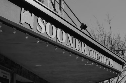
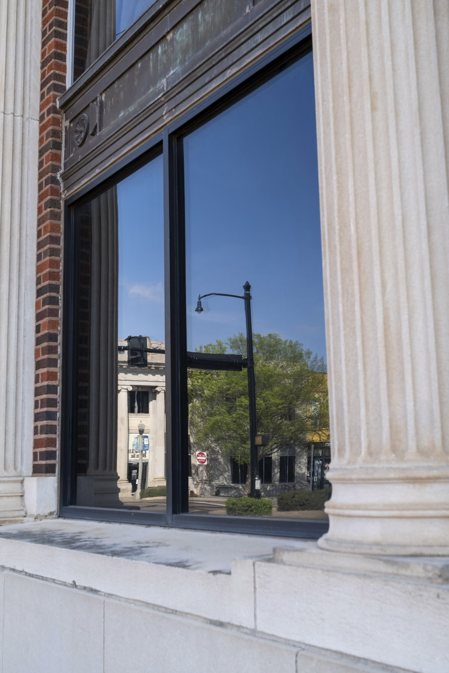
Tonight I don’t have many words left in me. The walk was long, the coffee strong, and the company excellent. Instead of more storytelling, I’ll leave you with some of the photographs I took during today’s jaunt. They may not capture every scent or sound, but I hope they give you a glimpse of the Norman I walked through this Monday.


-
Why I Chose the Fujifilm X-T4 for My Digital Photography
Over the past few weeks, I’ve been writing about the rising cost of film photography, and unfortunately, the trend hasn’t slowed down. With global instability, tariffs, silver prices, and persistent inflation, film prices continue to climb. Film photography is drifting into the territory of a luxury hobby. That’s a difficult reality to accept, especially for those of us who have relied on it as a primary creative outlet.
I don’t want photography, especially something as timeless and expressive as film, to become inaccessible. But practicality has a way of forcing decisions. For me, that meant looking for an alternative.
Some of you may remember that I previously owned a Sony A7cII. It was, in many ways, an incredible camera, compact, full-frame, and packed with modern technology. I genuinely loved using it. But after our move, I found myself back in the market, searching for something more affordable yet still capable. This time, however, I wanted something different, something more tactile, more physical in its design and operation.
My vision plays a major role in how I interact with cameras. I have about five degrees of vision in one eye and none in the other. On top of that, the vision I do have is around 20/200. That places me well within the definition of legal blindness in the United States, both in terms of acuity and visual field. In simple terms, I’m working with very limited visual information.
Because of that, the way a camera feels in my hands matters just as much as what it can do technically. Buttons, dials, and physical controls aren’t just aesthetic preferences, they’re essential. I need to be able to operate a camera through memory and touch as much as sight.
When I last searched for a camera, I came across Fujifilm’s X-T series but ultimately chose Sony for its compatibility with my collection of Minolta Maxxum lenses. This time, I revisited that decision.
I started researching the Fujifilm X-T lineup, the X-T3, X-T4 and X-T5. The X-T5, while impressive with its 40-megapixel sensor, is still relatively new and priced accordingly. The X-T3, on the other hand, is a solid performer but beginning to show its age, having been released back in 2018.
That left the X-T4.
The X-T4 strikes a balance that’s hard to ignore. It features a 26-megapixel sensor, excellent build quality, and meaningful upgrades like improved autofocus with eye tracking and a faster burst rate. More importantly, it retains the tactile design philosophy that Fujifilm is known for; dedicated dials, physical controls, and a shooting experience that feels deliberate and intuitive.
After some patient searching, I found a used X-T4 with a low shutter count for roughly half the price I had paid for my Sony. It felt like one of those rare moments where everything lines up perfectly; a professional level camera at a consumer level price.
I paired it with a few inexpensive adapters for M42, Pentax K, and Minolta mounts so I could continue using my vintage lenses. Even with its APS-C sensor, the image quality is outstanding, more than enough for my needs and far beyond what the price might suggest.
One aspect I didn’t expect to dive into was Fujifilm’s film simulation recipes. What started as curiosity quickly turned into a bit of a rabbit hole. I’ve since set up several custom recipes tailored to my preferences, and they’ve become a core part of how I shoot.
Regardless of whether I’m using film or digital, I always shoot in black and white. With my level of vision, contrast isn’t just an artistic choice, it’s a necessity. Color, while beautiful, is noise to me. It distracts more than it helps.
Contrast, on the other hand, defines the world.
I use a cane to navigate my surroundings, but when it comes to photography, contrast is what guides me. Within that narrow five-degree window of vision, everything is blurred. Without strong separation between light and dark, the scene collapses into an indistinct mass. But when contrast is present, when shadows and highlights carve out shapes, I can see. Not clearly, but meaningfully.
The X-T4 fits into that process beautifully. It’s a tool, first and foremost. I don’t pretend to use it to its full technical potential, but I use it often, and I use it with intention.
Like many visually impaired people, I rely heavily on memory. I memorize environments, layouts, and patterns. Photography is no different. I memorize my camera settings and the physical positions of the dials. I know how far to turn a knob, which direction adjusts what, and how each change will affect the image.
If I set my ISO to 160 and my shutter speed to 1/125 of a second, I can rely on muscle memory to adjust the aperture accordingly. That part becomes second nature.
What matters is the result, the ability to capture something from the world as I experience it.
The Fujifilm X-T4 has proven to be an incredible companion in that effort. It’s not just about specifications or features; it’s about how the camera fits into my way of seeing, or, more accurately, my way of interpreting what little I can see.
I’ll be putting together a long-term review in a few months after I’ve spent more time with it. For now, I can say that it has allowed me to keep creating at a time when film photography feels increasingly out of reach.
And that, more than anything, makes it worth it.
Below, I’ll be sharing some sample images from my time with the camera so far.


-
Is Film Dead or Thriving? Examining Current Trends
Like many of you, I vividly remember a time when film was the only game in town for photography, whether you were an amateur snapping family moments or a pro chasing assignments. Shooting on film meant deliberate choices: metering carefully, composing with intention, and accepting that every frame cost money and couldn’t be instantly reviewed. Then, in the mid-2000’s, digital cameras became viable options for amateurs and professionals alike. By the late 2000’s and early 2010’s, the shift was nearly complete. Digital offered instant feedback, virtually unlimited “film”, and far lower per-shot cost.
During the COVID era (roughly 2020–2022), and something unexpected happened: film experienced a genuine resurgence. Stuck at home, many people sought tactile, meaningful hobbies. Loading a roll, advancing manually, and waiting for development felt like a rebellion against endless screen time. I dusted off my old film cameras, started shooting again, and even set up a home darkroom. The same wave lifted vinyl records back into mainstream popularity, both analog formats offered an “essence” and grounded, earthly feel that digital files (just streams of 1’s and 0’s) simply can’t replicate for everyone.
Film’s magic lies in its imperfections and process. That grain, those subtle tonal shifts, the way light interacts with emulsion, it’s organic in a way pixels aren’t. Everyone who calls themselves a photographer should try film at least once: learn to meter by hand, understand reciprocity failure, and master the full workflow, including developing your own negatives.
Personally, I love pushing Arista EDU 400 to 800 or even 1600 in low-light situations, then developing in 510-Pyro to retain fine grain while squeezing out every stop of sensitivity. These decisions happen before you even press the shutter. It’s a thoughtful, premeditated craft that forces discipline.
I’m not a film snob. Digital is incredibly convenient: walk into a dim building, crank the ISO, and keep shooting without a second thought. No waiting for processing, no risk of light leaks or bad chemistry. For pros needing speed, volume, or client turnarounds, digital remains king—and rising film costs have pushed many back that way.
Recent trends show the resurgence has cooled somewhat. Sales boomed during the pandemic but appear to be flattening or stabilizing into a dedicated niche rather than explosive growth. The market remains healthy as a niche. Global photographic film sales exceeded 20 million rolls in 2023 (up 15% from 2022), with production ramping up (Kodak and Fujifilm increased capacity by around 20% in recent years to meet demand). Black-and-white film saw solid gains (10% shipment increase in some reports), and instant film surged in places like Asia-Pacific.
Prices tell a different story, especially for color film. Kodak and other manufacturers have raised prices multiple times since 2023, with increases of 10–25% in some cases, and more hikes announced or implemented in 2025–2026 (some reports cite 20–50% jumps for certain stocks due to raw material costs like silver, which spiked dramatically in 2025).
Average U.S. film prices rose about 9% from early to mid-2025 after a brief dip in 2024. Premium emulsions like Portra or slide films have climbed noticeably, while some black-and-white options (like Tri-X) have stayed more stable or even seen temporary reductions.
As an American, I’d love to shoot Kodak exclusively. It’s iconic, reliable, and made here. Kodak has made positive moves: resuming direct distribution of consumer stocks like Gold 200 and Ultramax 400 (after more than a decade through third parties), introducing new/rebranded options like Kodacolor 100/200, and taking greater control to stabilize supply and pricing. They’ve also expanded professional lines and boosted motion-picture film sales (higher than since 2014 in some years). I hope this extends fully to TMax black-and-white films, potentially lowering prices through better distribution and reduced middlemen.
So, is film dead? Absolutely not. It’s evolved from the default medium to a cherished, intentional alternative like vinyl in music. The “end of an era” might refer to film’s dominance, but we’re in a new one: a vibrant niche supported by enthusiasts, artists, educators, and even some pros who mix formats. Film won’t reclaim the mass market, but it doesn’t need to. As long as manufacturers like Kodak, Ilford, and Fujifilm keep producing, labs keep developing, and people keep loading rolls, analog photography endures.
What about you? Do you shoot film regularly, or has the price creep pushed you more toward digital? Have you noticed changes in availability or costs lately? I’d love to hear your thoughts in the comments, whether you’re a die-hard analog shooter or someone who’s curious to try it.