-
Every Dot Counts: Contracted Braille (UEB Grade 2) Explained
As a blind photographer, I spend a lot of time thinking about how we take in the world. For me, reading is done with my fingertips. Braille is a big part of my daily life, so I made this short video for anyone learning it, and for the parents and teachers helping them. Here’s what the video covers.
It all starts with one cell
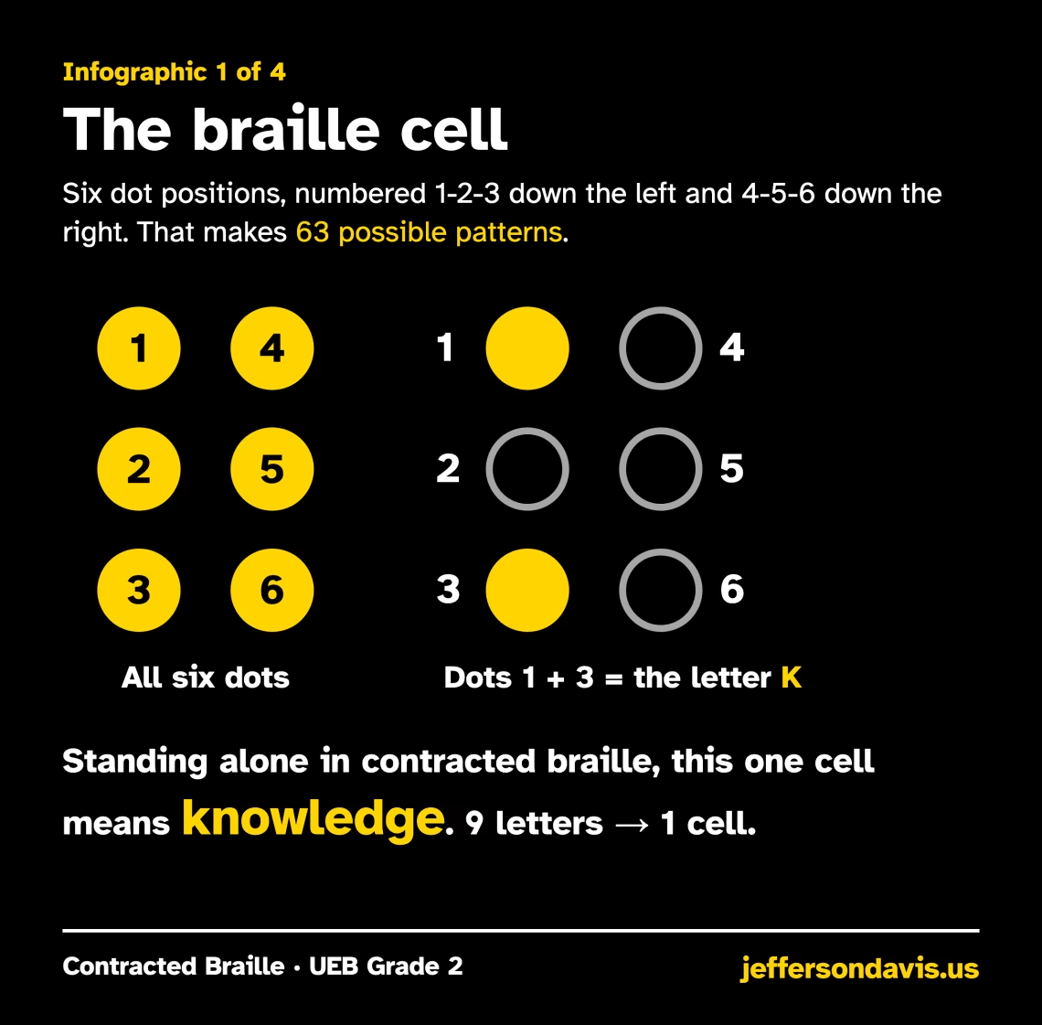
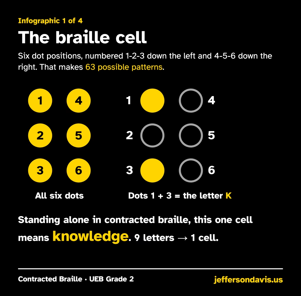
Every braille character is built from a single cell of six dot positions. Dots 1, 2 and 3 run down the left side, and dots 4, 5 and 6 run down the right. That gives just 63 possible patterns. Raise dots 1 and 3 and you have the letter K. In contracted braille, that same cell standing alone means a whole word: “knowledge.”
Why contract?
Uncontracted braille spells out every letter. Contracted braille, officially Unified English Braille (UEB) Grade 2, uses about 180 contractions to save space and make reading faster. Most books, signs and documents in the U.S. use it.
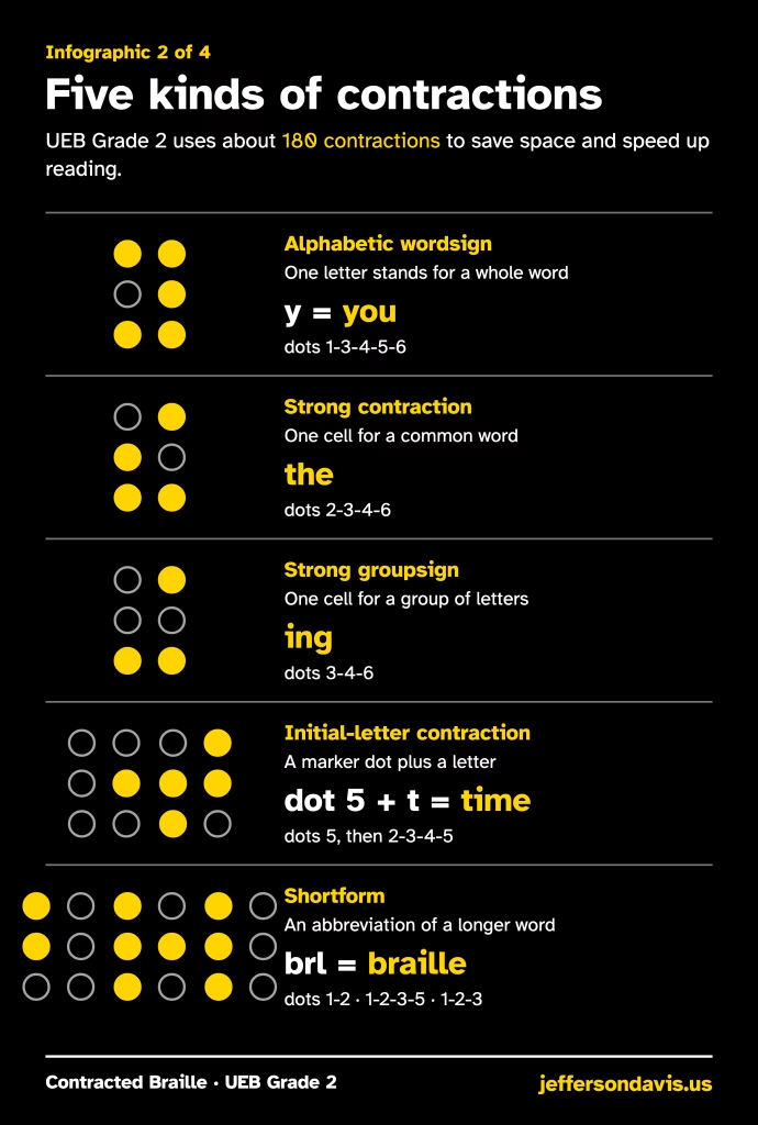
Here are the main kinds you’ll meet:
- Alphabetic wordsigns: one letter stands for a word, like Y for “you.”
- Strong contractions and groupsigns: one cell for “the,” “and,” “for,” or “ing.”
- Initial-letter contractions: a marker dot plus a letter. Dot 5, then T, makes “time.”
- Shortforms: abbreviations, like B-R-L for “braille.”
What it adds up to
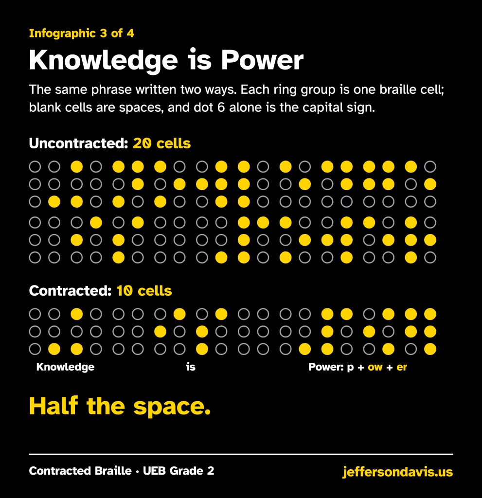
Take the phrase “Knowledge is Power.” Uncontracted, it takes 20 cells. Contracted, it takes just 10. Half the space, and a lot less ground for your fingers to cover.
The switch to UEB
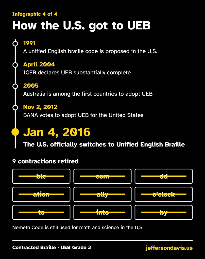
On January 4, 2016 (World Braille Day, Louis Braille’s birthday), the U.S. officially switched to Unified English Braille, the code shared across the English-speaking world. Nine older contractions were retired along the way, and Nemeth Code is still used for math and science.
Keep practicing
If you’re learning contracted braille, go one family of contractions at a time. If you’re a parent or teacher, share the infographics: each one is high-contrast and easy to print. Every dot counts. I will be making an in depth series soon.
-
FED 4 Review: A Soviet Rangefinder, a Leaky Shutter and a Light Meter That Quit
I’ve talked about the FED 4 before, and if you’re reading this months down the road you can go back and find that first look. This is the fuller write-up: what was wrong with my camera when it arrived, how I fixed the shutter, the light meter that doesn’t really work, and how the first roll came out.
The short version: it’s a good camera that took some great images, with a lever wind I really like. If you buy one, expect a dead meter and plan your repairs carefully.
Where the FED came from
FED is an acronym. It stands for Felix Edmundovich Dzerzhinsky, and the letters come from the name of a children’s labour commune founded in his honor in December 1927 in Kharkiv, then the capital of Soviet Ukraine. The commune was part orphanage and part workshop, run by the educator Anton Makarenko, and at first it made simple electric drills. In 1932 the factory’s new director, A. S. Bronevoy, proposed copying the German Leica II. Mass production began in 1934, and the FED became the Soviet Union’s first 35mm camera.
When German forces overran Kharkiv during World War II, parts were evacuated to Berdsk in Siberia. About 4,000 cameras were assembled there between 1942 and early 1946, before production returned to Kharkiv. Meanwhile, the Krasnogorsk Mechanical Factory (KMZ) near Moscow began its own inexpensive Leica II copy in 1948, the Zorki. That shared Leica ancestry is why early FEDs and Zorkis look and work so much alike, and why the older models are simple to work on. The Zorki-C mentioned below is the Zorki S of 1955, since the Cyrillic С is an S.
From there the FED line developed its own designs. The FED 2 (1955) combined the rangefinder and viewfinder in one window. The FED 3 added slow shutter speeds, and its later version swapped the thumbwheel advance for a lever. The FED 4 arrived in 1964 as the first FED with a built-in exposure meter, an uncoupled selenium cell. The FED 4 came in two versions. The FED 4a (1964–1971) has a knob wind, and the FED 4b (1969–1976) has a lever wind, so mine is a 4b. The FED 5 eventually replaced both the FED 3 and the FED 4. Rangefinder production wound down in the mid-1990s. According to the factory’s own history, it stopped making cameras altogether in 1997, after about 8.6 million.
The FED 4 at a glance
- Made
- 1964 to the late 1970s in Kharkiv, Soviet Ukraine (sources give 1977 or 1980 as the end)
- Versions
- FED 4a with knob wind (1964–1971); FED 4b with lever wind (1969–1976)
- Type
- 35mm rangefinder with interchangeable lenses, Leica-type M39 screw mount
- Standard lens
- Industar-61, f/2.8 (mine came with one)
- Shutter
- Cloth focal-plane shutter with rubberized curtains, 1 s to 1/500 s plus B, flash sync at 1/30 s, self-timer
- Light meter
- Uncoupled selenium meter, with the cell on the front of the top housing and a match-needle readout on top (mine doesn’t work for normal readings)
Pinhole light leaks in the shutter curtain
When I bought this camera, it had light leaks in the shutter curtain. That’s common on old rangefinders, and really on any old camera with rubberized cloth shutter curtains. The rubber coating dries out and cracks over the decades, and tiny pinholes open up in the cloth. Each pinhole lets a little light through while the shutter is closed, and it shows up on the film as spots or streaks.
I found the pinholes by taking the lens off, opening the back, and shining a flashlight from the lens mount side through toward the film chamber. Wherever the curtain had a pinhole, a small point of light came through on the film side, and I noted each one.
I repaired them with liquid rubber, applied over each pinhole and left to solidify over a 24-hour period.
The light meter: chunky, and useless for real readings
The FED 4 has a chunky selenium light meter built into its tall top housing, and that housing makes the camera noticeably taller than earlier FEDs. On mine the light meter doesn’t work for everyday shooting. It is sensitive, and it reacts to light, but it reads as if it’s stuck around ISO (ASA) 400. In normal light it’s useless.
That isn’t unusual. Selenium cells don’t need a battery, but they lose sensitivity as they age, and these cameras are decades old. So if you buy a FED 4, keep that in mind: it has the meter, but it’s probably not going to work. Bring a handheld meter or a phone meter app, or use the Sunny 16 rule.
The Industar-61 lens
Mine came with an Industar-61. It’s a beautiful lens with clicks between the different aperture settings, which is very nice. I’m used to the Jupiter-8 (Юпитер-8 in Cyrillic), which doesn’t give you that response. For me, being able to feel and count the clicks means I can set the aperture without having to read the ring.
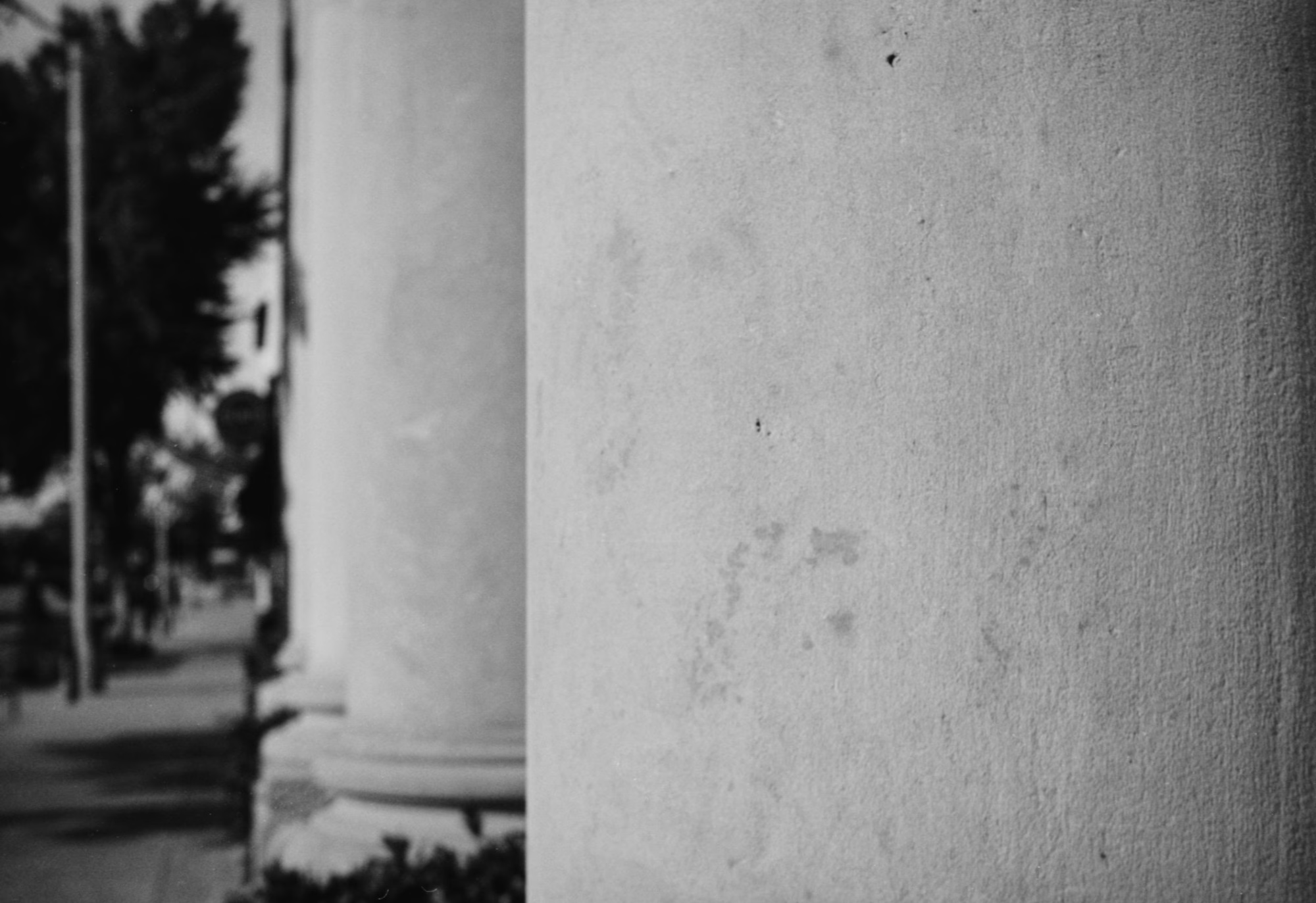
Focused close on a column, with the street falling away into soft blur. Handling: the lever wind is the best part
I’ve enjoyed shooting it. I love the lever compared to a knob, because it’s just quick. If I need to fire off several frames in a row, quick, quick, quick, a lever is what you want. I never had problems with knob-wind cameras, but if you need to shoot something in a hurry, the lever is a huge blessing.
Repairs: what to know before you buy
These cameras are a task to take apart. If you think you’re going to have to work on one yourself, the FED 4 isn’t the easiest place to start:
- FED 3, the one with the lever, is a lot easier.
- Zorki-4K is easier still than the FED 4.
- Zorkis in general can be a little less finely finished, but they’re easier to work on.
- FED 2, the original FED and the Zorki-C, the older Leica-style cameras, are all a lot easier to work on.
The first roll
Here’s a selection from my first roll through the FED 4, shot around Norman. I’ll be putting another roll through it soon.
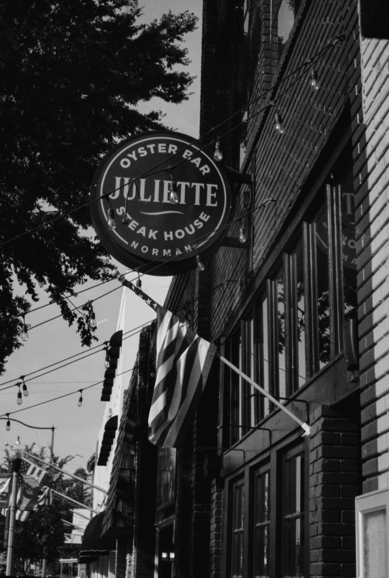
Juliette in downtown Norman. 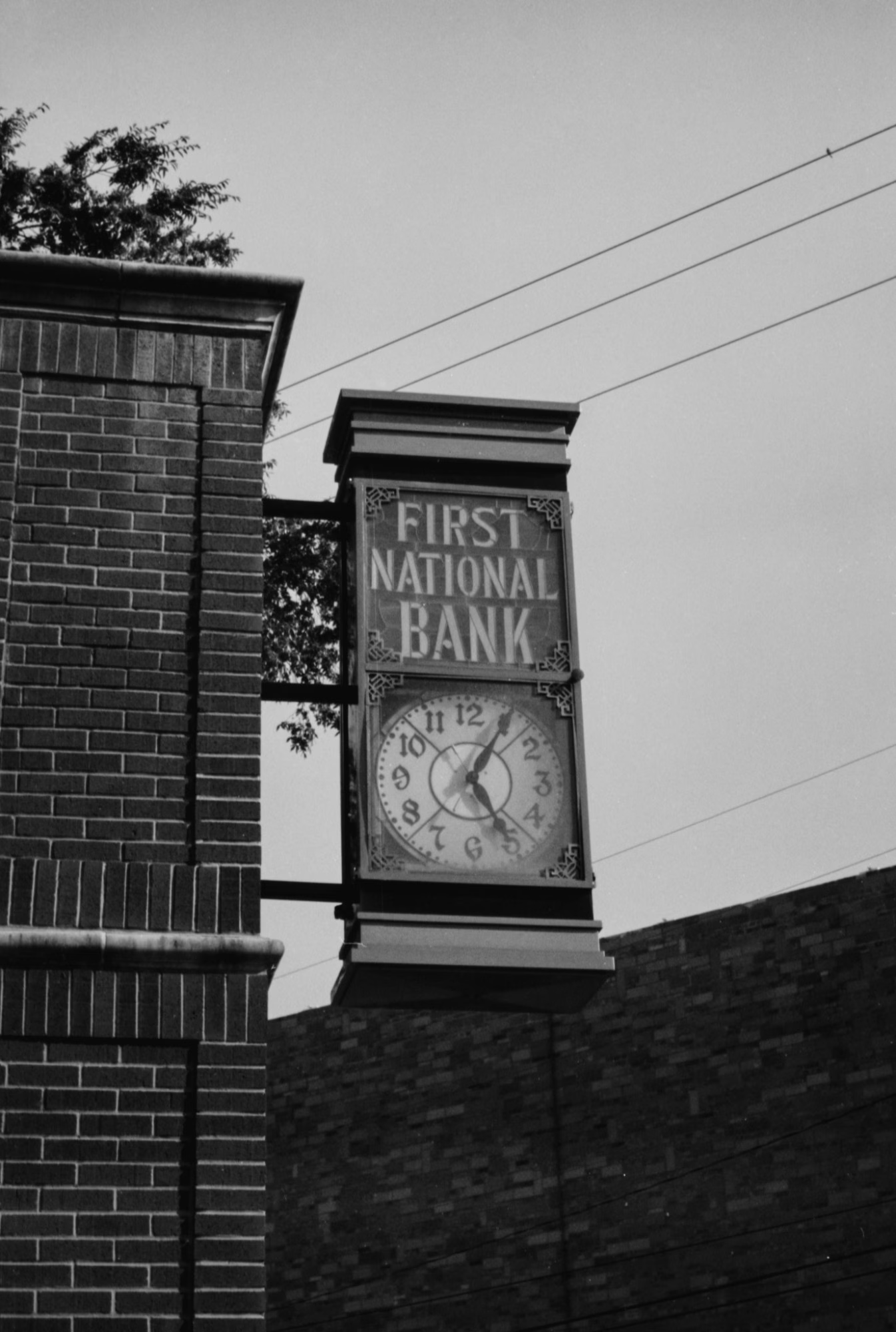
First National Bank clock. 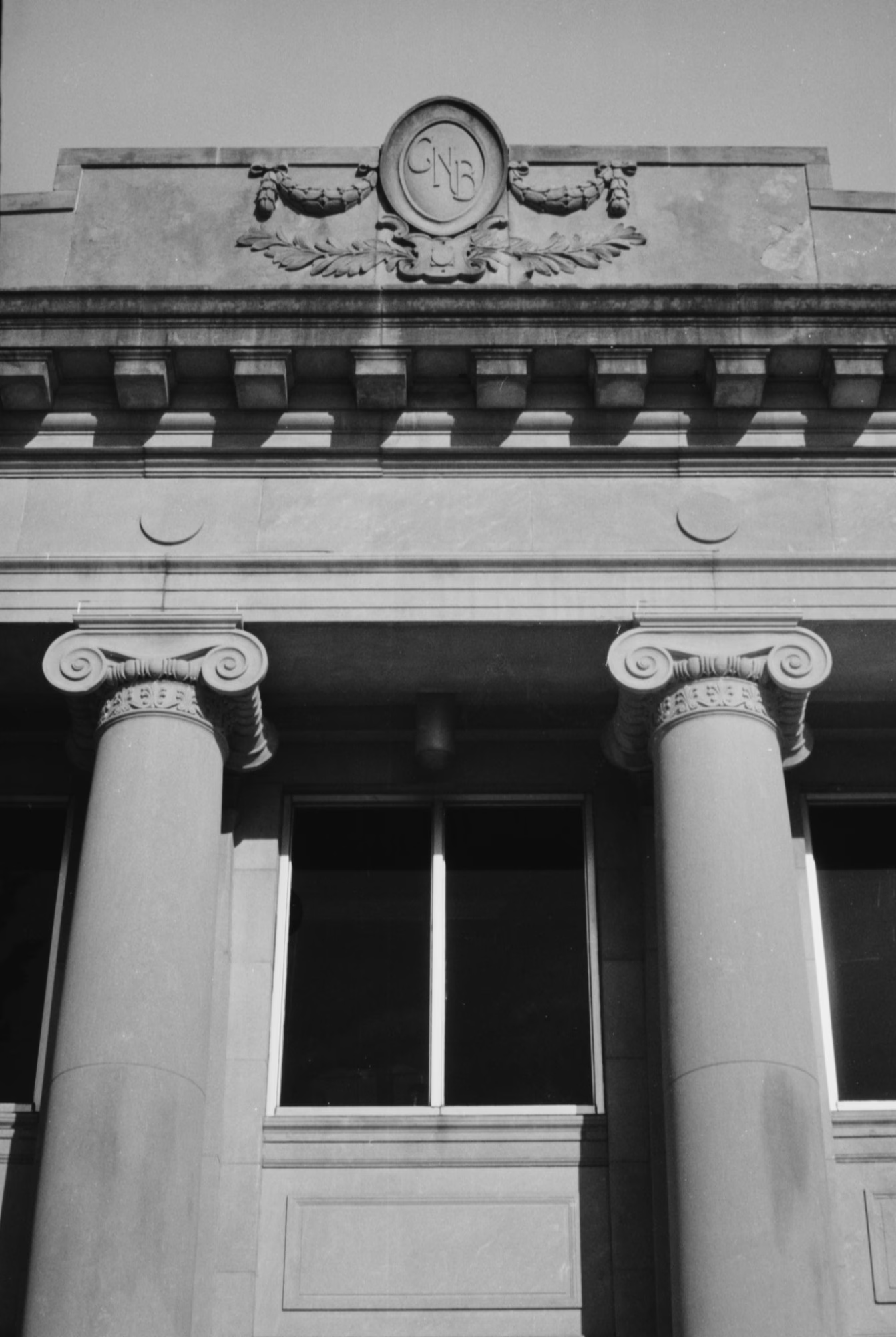
Columns and the CNB crest. 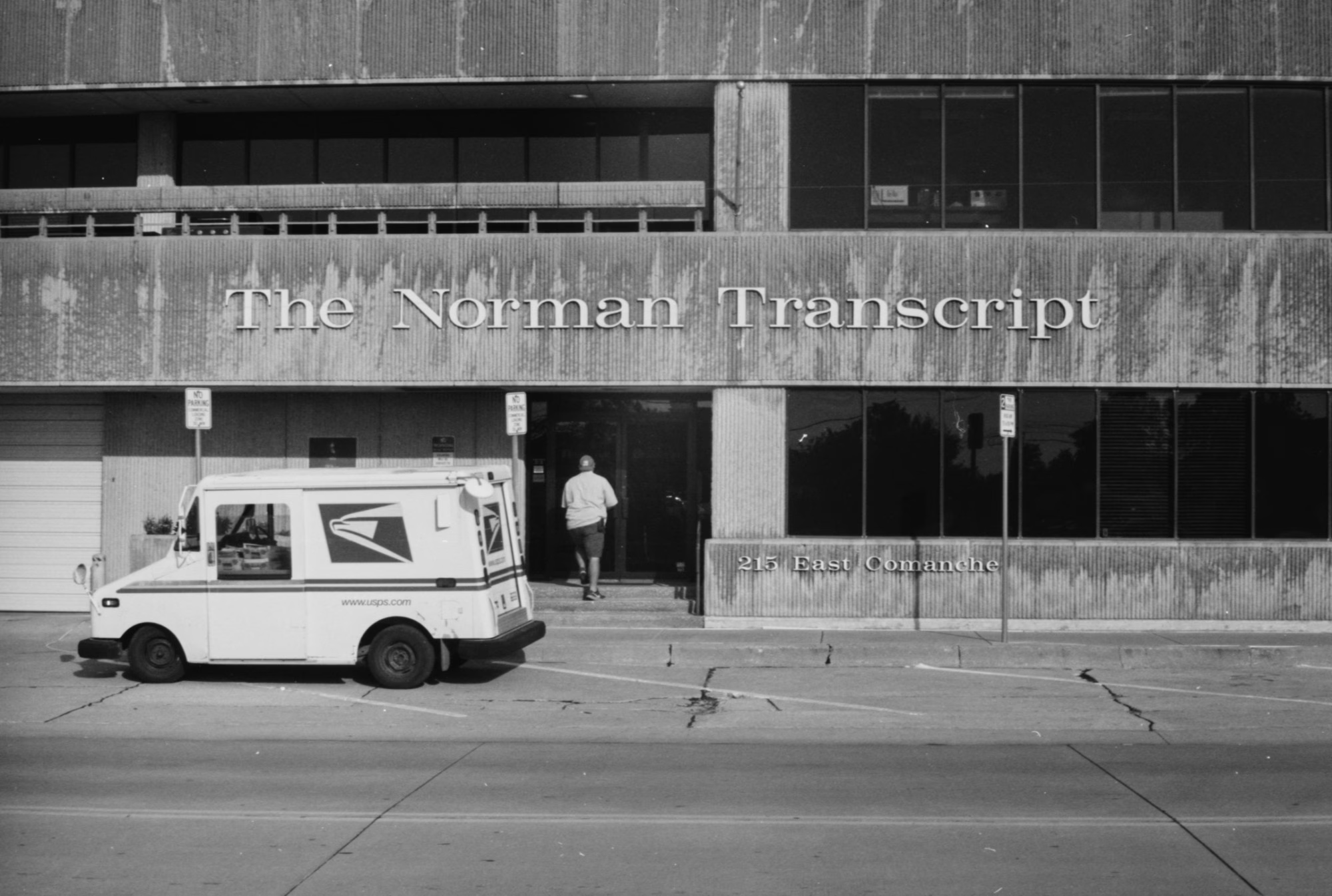
The Norman Transcript building, with the mail arriving. 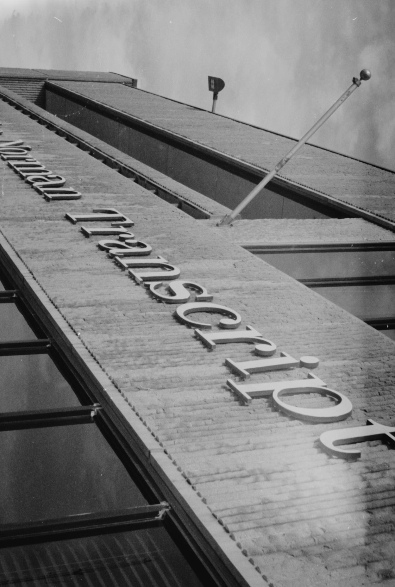
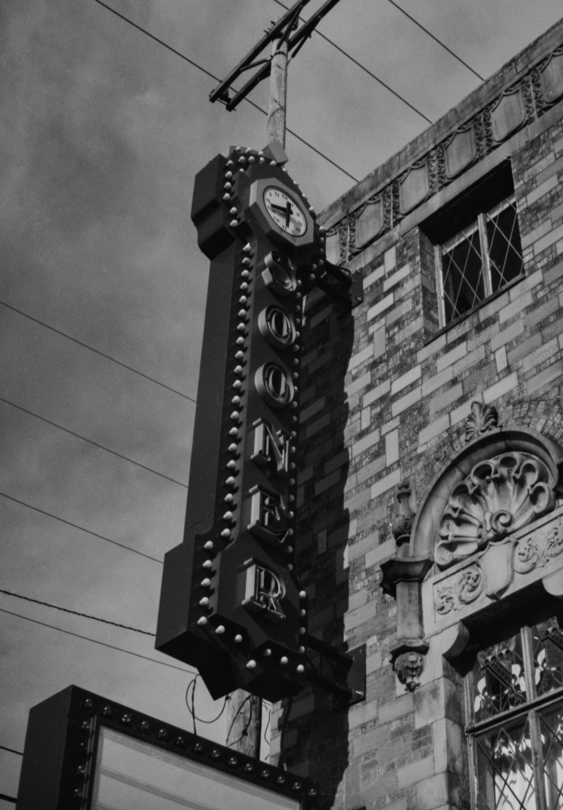
The same sign, looking straight up. 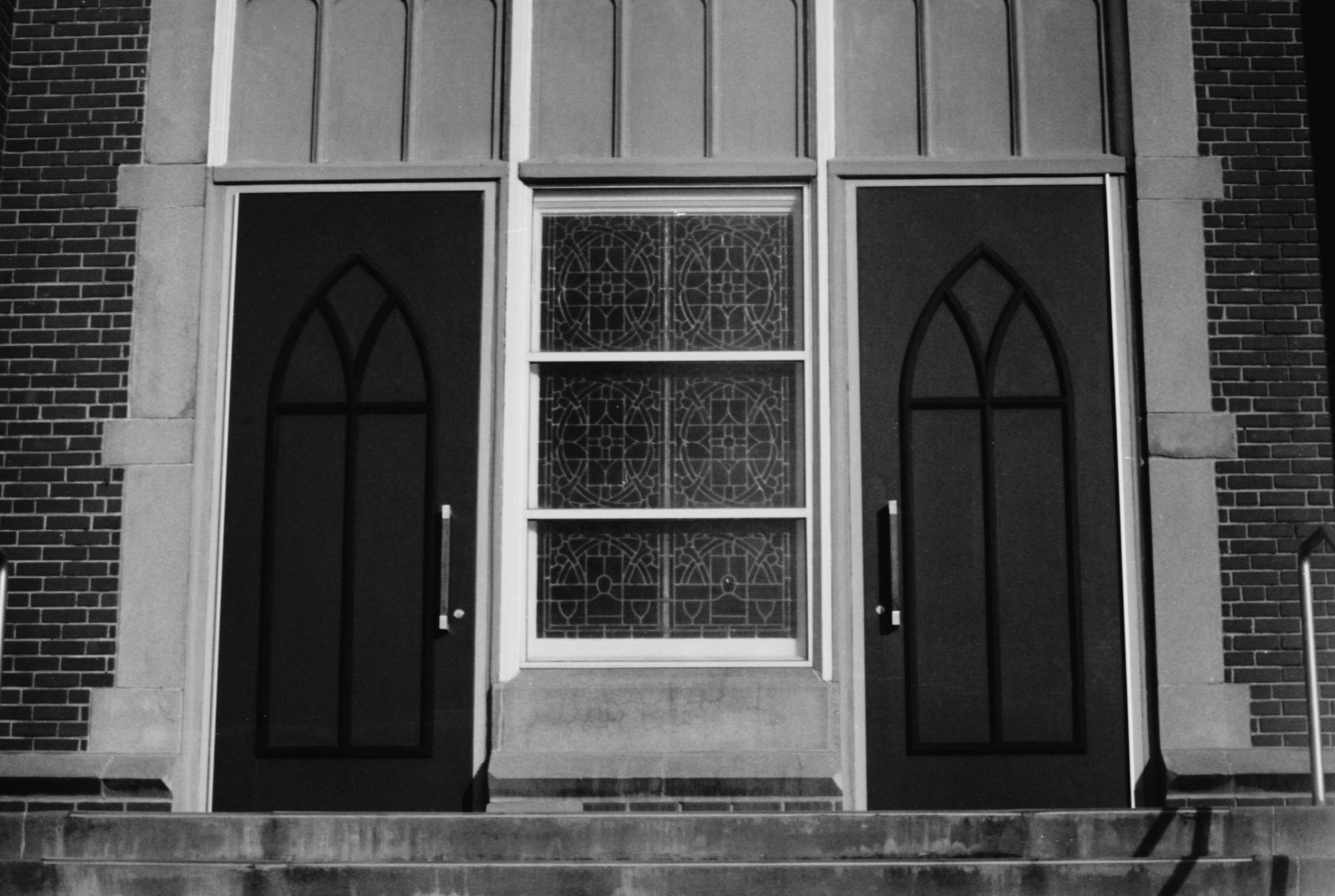
Church doors and leaded glass. 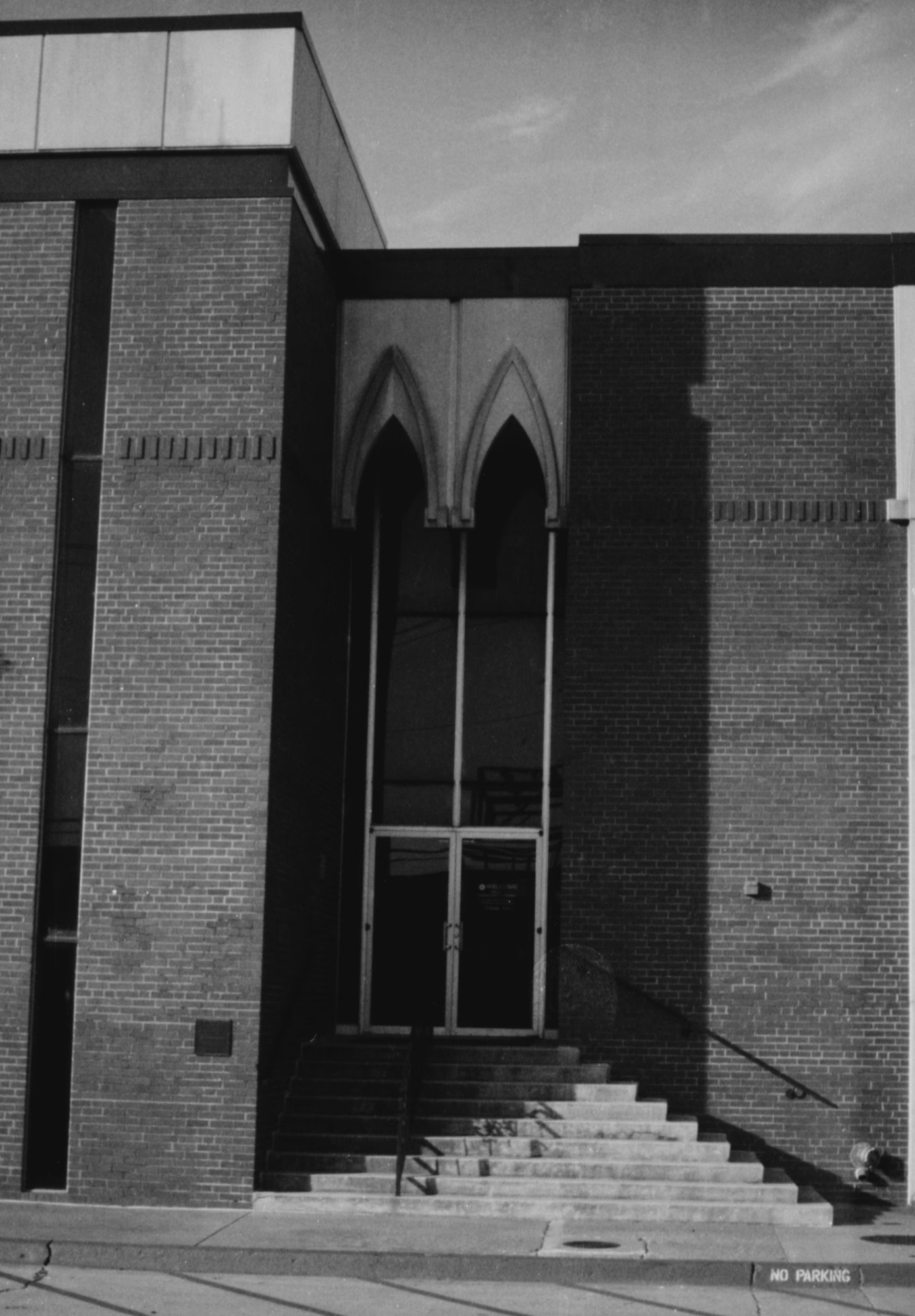
A modern take on the Gothic arch. 
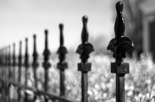
Fence boards and the light between them. 
String lights on the back fence. Verdict
The FED 4 is a great camera. It took some great images, and the lever wind makes it quicker to shoot than knob-wind models like the FED 2, the FED 4a and the early Zorkis. The Industar-61’s click-stops are a real plus if you set your aperture by feel.
Go in knowing two things. The light meter almost certainly won’t help you, so bring another way to meter. And if the shutter curtain has pinholes, they can be fixed with liquid rubber and patience. Just know that the FED 4 is harder to work on than a FED 3, a Zorki-4K or the older Leica-style cameras.
Watch the video preview: FED 4 Preview on YouTube.
Sources
- FED (camera), Wikipedia
- FED 4, Camera-wiki.org
- Zorki, Wikipedia
-
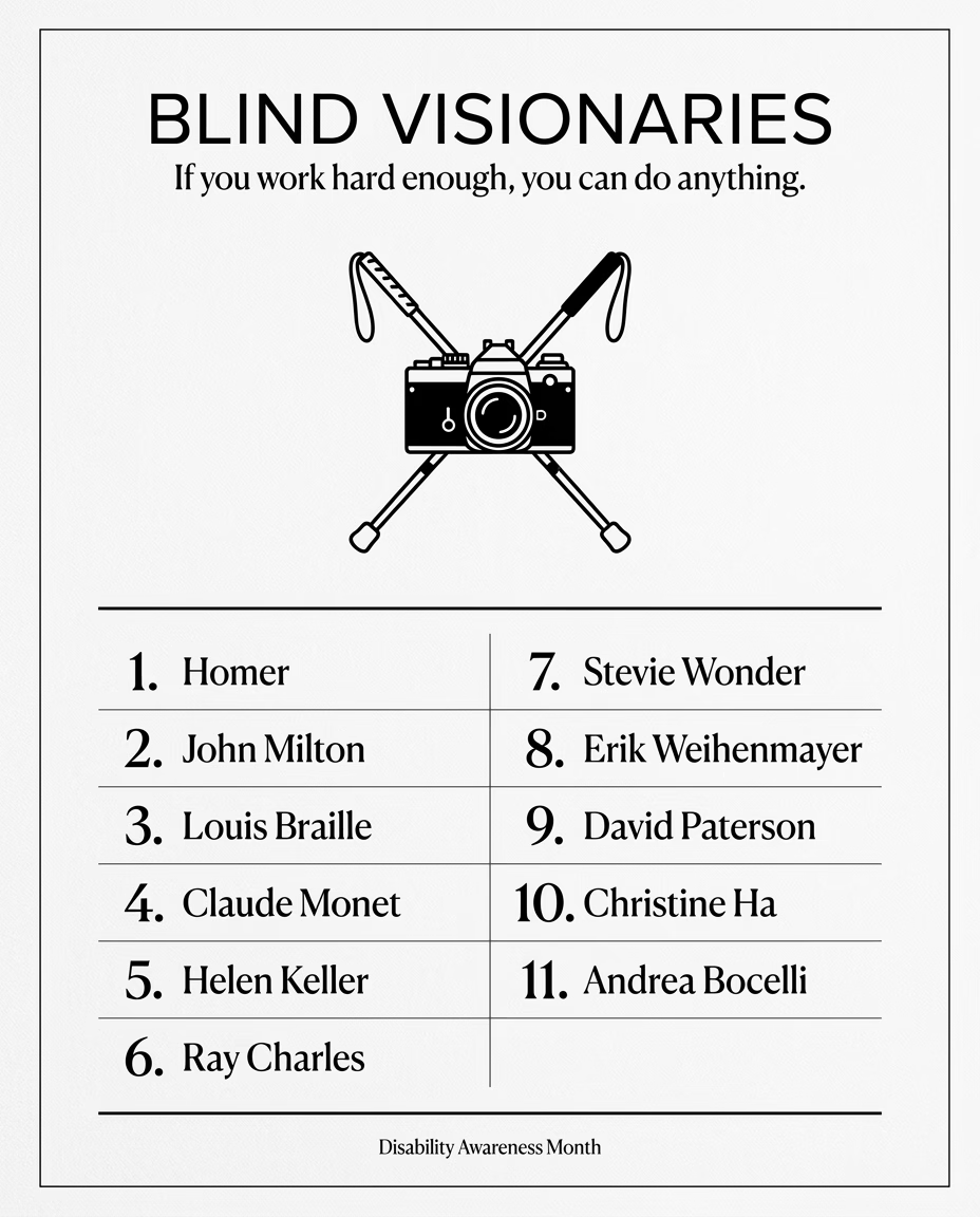
Blind Visionaries: 11 People Who Proved Sight Isn’t the Same as Vision
Disability Awareness Month
There’s a lazy assumption baked into the English language itself: that “vision” means eyesight, that “seeing” means understanding, that “insight” requires a working pair of eyes. The people on this list spent their lives quietly, sometimes loudly, disproving that assumption. They didn’t succeed despite being blind so much as they succeeded as blind people, full stop, doing the work in front of them until the work was undeniable.
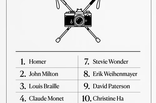
Homer (c. 8th century BCE) Ancient tradition holds that the poet credited with the Iliad and the Odyssey, two works that shaped Western literature for the next 2,800 years, was blind. Whether or not that’s literal history, “Homer” became an archetype: proof that the tradition of blind storytellers is as old as storytelling itself.
John Milton (1608–1674) Milton was already a respected poet and pamphleteer when he went completely blind in his mid-40s. He didn’t stop writing, he dictated Paradise Lost, one of the greatest epic poems in the English language, line by line to his daughters and assistants.
Louis Braille (1809–1852) Blinded in a childhood accident, Braille spent his teenage years at the Royal Institute for Blind Youth in Paris developing a tactile reading and writing system based on raised dots. He was 15. That system still bears his name and still opens up literacy for blind people worldwide.
Claude Monet (1840–1926) Cataracts crept in during Monet’s 60s, and by his early 80s he was legally blind, seeing the world through a yellow-brown haze that reshaped his palette entirely. He kept painting anyway — the massive, immersive Water Lilies murals now in the Musée de l’Orangerie were largely completed while his sight was failing.
A personal aside on this one. I’m severely visually impaired myself, and I still pick up a camera most days. So I’ll admit I have a soft spot for Monet that goes beyond the history books. When I put my eye up to the viewfinder now, I can’t just look and see. I have to scan the frame left to right, top to bottom, like a printer laying down a page, and hold each piece in my mind until I’ve stitched together something like a true picture of the scene — blurry, incomplete, but true. It takes time. It takes patience. Most of the critics who write about Monet’s late work talk about it like a tragedy that happened to a genius — the poor man, painting through the fog. I don’t read it that way. I think he was doing the same thing I do at every viewfinder: piecing together a whole scene from a vision that only gives you fragments at a time, and trusting the patience of that process instead of quitting because his eyes weren’t what they used to be. I don’t think you can fully understand that decision until you’ve had to make something honest out of a blurred, partial view of the world.
Helen Keller (1880–1968) Deafblind from infancy after an illness, Keller learned to communicate through her teacher Anne Sullivan and went on to graduate from Radcliffe College, write a dozen books, and become one of the most influential advocates for disability rights, women’s suffrage, and workers’ rights of the 20th century.
Ray Charles (1930–2004) Blind by age seven from glaucoma, Charles built a career that fused gospel, blues, jazz, and country into something entirely his own and in the process became one of the most influential musicians in American history.
Stevie Wonder (b. 1950) Blind since shortly after birth, Wonder was a Motown prodigy by age 13 and has since won 25 Grammy Awards, written some of the most enduring songs of the 20th century, and remained a fierce advocate for accessibility and civil rights.
Erik Weihenmayer (b. 1968) Blind since age 13 from a rare eye disease, Weihenmayer is the only blind person to reach the summit of Mount Everest, and he didn’t stop there, going on to complete the Seven Summits and kayak the length of the Grand Canyon.
David Paterson (b. 1954) Legally blind since infancy due to an infection, Paterson built a career in New York state politics and became Governor of New York in 2008, the first legally blind person to serve as a U.S. governor.
Christine Ha (b. 1979) Ha began losing her vision in her 20s to a rare autoimmune condition, right around the time she was falling in love with cooking. In 2012 she became the first blind contestant and winner of MasterChef US, and later opened her own celebrated restaurant, The Blind Goat, in Houston.
Andrea Bocelli (b. 1958) Born with poor eyesight and blinded completely at age 12 after a soccer accident, Bocelli went on to become one of the best-selling artists in music history, bringing opera to audiences who’d never have sought it out otherwise.
None of these people were handed anything. They read by dots under their fingertips, or dictated a masterpiece word by word, or cooked by touch and smell in front of judges who doubted them, or climbed a mountain that kills people who can see just fine. The through line isn’t blindness, it’s the refusal to let blindness be the whole story.
That’s the point of this list, and it’s the point of this month: work hard enough, at the right thing, for long enough, and you can do more than anyone expected, including, sometimes, yourself.
-
Why Every Office Door in City Hall Must Have Raised Lettering and Braille: ADA Signage Requirements for Municipal Public Buildings
A Guide for Advocates and Citizens Who Are Blind or Visually Impaired
More Than a Legal Checkbox
Imagine arriving at your city’s municipal building to pay a utility bill, apply for a permit, or attend City Council meetings and having no way to know which door leads where. No readable signs. No way to distinguish the Tax Assessor’s office from the City Clerk’s office from a utility closet.
For the more than 7.6 million Americans living with visual disabilities, this is not a hypothetical scenario. It is every day.
The Americans with Disabilities Act (ADA) established federal standards for accessible signage in public buildings, standards that many municipalities still fail to meet. This post breaks down exactly what the law requires, why it matters, and why raised lettering and Braille at every office door isn’t just a legal obligation, it is a basic act of respect and dignity.
What the ADA Says About Signage
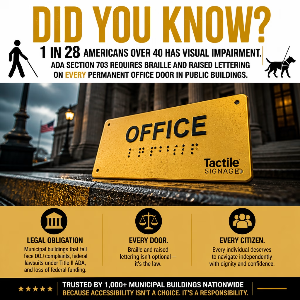
The ADA Standards for Accessible Design, specifically Section 703, establishes requirements for signs in public facilities. These requirements apply directly to city and county municipal buildings, including courthouses, city halls, permit offices, public health departments, libraries, and more.
Signs That Must Have Raised Characters and Braille
Under ADA standards, any sign that identifies a permanent room or space must include:
- Raised (tactile) characters — letters and numbers that project at least 1/32 inch from the sign’s surface
- Grade 2 Braille — the contracted form of Braille used by most Braille readers
- Both uppercase and lowercase letters — raised characters must use uppercase letters only, but visual characters on the same sign may use mixed case
This requirement applies to every permanent room in a municipal building, including:
- Individual office doors (City Clerk, Tax Assessor, Building Permits, etc.)
- Conference rooms
- Restrooms
- Stairwells and exit doors
- Storage and utility rooms accessible to the public
- Elevator lobbies and floors
Placement Requirements
The ADA is specific about where tactile signs must be mounted:
- On the wall on the latch side of the door — the side where the door handle is located
- Centerline between 48 and 60 inches from the finished floor, placing the Braille and raised characters within reach of most adults and wheelchair users.
- At least 18 inches from the nearest corner, ensuring a person can approach without bumping into the door as it swings open
This placement is not arbitrary. It allows a blind or visually impaired person to locate the sign predictably, approach safely, and read it with their fingertips without guessing where to reach.
Character and Braille Specifications
- Raised characters must be between 5/8 inch and 2 inches in height
- Characters must have a sans-serif font (no decorative serifs that complicate tactile reading)
- There must be a non-glare finish on the sign surface
- Characters must contrast visually with the sign background (for those with low vision)
- Braille dots must follow specific dome height and spacing requirements per ANSI/ICC A117.1 standards
Why Municipal Buildings Must Do Better: 10 Reasons Braille and Raised Lettering Matter
1. Independence Is a Civil Right
The ADA was signed into law in 1990 with a foundational principle: people with disabilities have the right to participate fully in civic life. A blind resident cannot independently navigate a city building without tactile signage. Dependence on sighted assistance for something as basic as finding an office strips away autonomy that every citizen deserves.
2. Municipal Buildings Serve Everyone, Including Blind Taxpayers
City halls, county courthouses, and public service offices exist to serve all residents. Blind and visually impaired citizens pay the same taxes, hold the same rights, and require the same services as sighted residents. Accessible signage is not a special accommodation, it is equal service.
3. Visual Impairment Is More Common Than Most Realize
According to the CDC, approximately 1 in 28 Americans over age 40 has some form of visual impairment. Age-related vision loss, macular degeneration, glaucoma, diabetic retinopathy — means that the population of people who benefit from tactile signage grows every year. Seniors accessing Medicare offices, veteran services, or property tax assistance are disproportionately affected.
4. Low Vision ≠ No Vision: High-Contrast Signage Helps Too
Not everyone who benefits from accessible signage is completely blind. People with low vision, those who cannot read standard print even with glasses benefit enormously from high-contrast visual signs combined with tactile elements. The ADA’s signage standards address both populations simultaneously.
5. Braille Literacy Is a Lifeline, Not a Relic
Some assume that audio technology has replaced Braille. It has not. Studies consistently show that Braille readers have significantly higher employment rates and literacy levels than blind individuals who do not read Braille. Providing Braille signage validates and supports Braille literacy and acknowledges that technology (phones, screen readers) should supplement, not replace, physical accessibility.
6. Tactile Signs Enable Quiet, Private Navigation
Relying on a phone’s GPS or asking a stranger for help every time you approach a door is not a dignified or feasible. Tactile signage allows a blind person to navigate confidently and quietly without announcing their destination to everyone nearby, which matters especially in sensitive settings like public health offices, legal aid, or social services.
7. Consistent Signage Reduces Anxiety and Increases Confidence
For individuals navigating a new or unfamiliar building, predictability is everything. When tactile signs are consistently placed on the latch side of every door at the same height, a blind person can build a mental map of the space efficiently. Inconsistent or missing signage creates frustration, confusion, and safety risks.
8. It Protects the Municipality from Legal Liability
Municipalities that fail to meet ADA signage standards are subject to:
- Complaints to the U.S. Department of Justice
- Civil lawsuits under Title II of the ADA, which applies directly to state and local government entities
- Loss of federal funding, cities receiving federal grants must comply with Section 504 of the Rehabilitation Act, which has parallel accessibility requirements
Proactive compliance is far less costly than litigation, settlements, or federal audits.
9. It Sets a Standard for the Entire Community
When a city hall models full ADA compliance, it sends a message to local businesses, schools, and organizations. Municipal buildings are civic anchors, what they do (or fail to do) shapes community norms around accessibility. Leading by example has a ripple effect throughout the entire community.
10. People Are Waiting
Every day that a municipal building operates without compliant tactile signage is another day that a blind resident cannot find the Building Permits office independently or attend those City Council meetings. Another day someone must ask for help to find a restroom. Another day a veteran cannot locate the VA liaison’s door without assistance. The harm is not theoretical, it is ongoing reality.
Common Violations to Watch For in Municipal Buildings
If you are an accessibility advocate, a blind resident, or a city official conducting an audit, here are the most frequent ADA signage violations found in municipal buildings:
- Signs mounted on the door itself rather than the adjacent wall
- Signs placed too high or too low — outside the 48–60 inch centerline range
- Pictogram-only signs without accompanying raised text and Braille
- Braille that is incorrect or outdated — some older signs use Grade 1 Braille, which does not meet current standards
- Glare-producing sign finishes that reduce legibility for low-vision users
- Insufficient contrast between characters and sign background
- Temporary or paper signs substituting for permanent tactile signs
- Missing signs on rooms that have been repurposed without updating signage
What Advocates and Residents Can Do
File a Complaint
Anyone can file an ADA Title II complaint with the U.S. Department of Justice Civil Rights Division at www.ada.gov or call 1-800-514-0301 (Voice) / 1-800-514-0383 (TTY).
Request a Self-Evaluation
Under ADA Title II, local governments are required to conduct a self-evaluation of their programs and facilities. Residents can formally request that a city conduct or update its self-evaluation and transition plan.
Connect With Your State’s Protection & Advocacy Organization
Every state has a federally funded Protection & Advocacy (P&A) organization that provides free legal assistance to people with disabilities. They can help you navigate complaints or advocate for systemic change.
Attend City Council Meetings
Accessibility issues in public buildings are legitimate policy concerns. Showing up to public comment periods and city council meetings puts pressure on elected officials to allocate budget for ADA compliance upgrades.
Conclusion: Braille on Every Door Is Not Too Much to Ask
A small tactile sign, a few raised letters, a line of Braille dots, costs very little. What it provides is immeasurable: the ability to move through a public building independently, privately, and with confidence.
Municipal buildings belong to everyone. The blind resident who needs to renew a license, attend a hearing, or access public records deserves the same frictionless experience as any sighted visitor. Raised lettering and Braille signage at every office door is not a luxury upgrade. It is not only the Law but also the right thing to do.
-
Understanding ADA Compliance vs. Accessibility
When people talk about the Americans with Disabilities Act (ADA), they often assume that “compliant” automatically means “accessible.” It doesn’t. In fact, the gap between those two ideas is where many disabled people run into the most frustrating and sometimes dangerous experiences.
ADA compliance is about meeting the minimum legal requirements. It’s a checklist: Are there braille room signs? Are doorways wide enough? Is there a ramp?
ADA accessibility, on the other hand, is about whether a space is actually usable in the real world by people with disabilities. It’s not just “Did you install the sign?”, it’s “Does this space work for someone navigating it independently?”.
That distinction might sound subtle, but in practice, it’s enormous.
A Real Experience: When Compliance Falls Short
Recently, I had to visit Norman Regional Hospital with my wife. She was dealing with some health issues, thankfully, she’s doing better now, but during the day and a half I spent there, I encountered a pattern that perfectly illustrates the difference between compliance and true accessibility.
In case you found this post through search and don’t know me: I’m blind. I have about two degrees of peripheral vision left, but what I see is so diffused it’s essentially a blur.
Throughout my stay, I asked staff where I could find things like vending machines. Every time, someone kindly offered to bring me food or a drink instead. I appreciated the help, but that wasn’t the point. I wanted the ability to navigate independently, to explore the space like anyone else.
At one point, I was even asked not to leave the room. It was framed as concern for my safety. And I understand that instinct, but it raises an important question: why is the environment so difficult to navigate that independence is discouraged?
That’s not accessibility. That’s containment.
Where the Hospital Got It Right—and Wrong
To be fair, the hospital did check some ADA boxes. There were braille signs on every room. That’s compliance.
But here’s where things broke down:
- There were no braille or raised-letter navigation signs to help someone move through hallways.
- The main entrance was massive and confusing, with no clear tactile or accessible guidance.
- I needed a family member to guide me back to my wife’s room after leaving the building.
- Worst of all, the braille on her room sign was wrong—off by one digit. I found another incorrect sign elsewhere.
This is the perfect example of compliance without usability. The signs existed, so technically a box may have been checked. But if the information is inaccurate or incomplete, it doesn’t just fail, it misleads.
That’s not accessibility. That’s a hazard.
Compliance Is the Floor, Not the Ceiling
The ADA, particularly through standards like ADA Title III and ADA Title II, lays out requirements for signage, navigation, and equal access. But laws can only go so far.
They define the minimum. They don’t guarantee a good experience.
True accessibility asks deeper questions:
- Can someone navigate the space without assistance?
- Is the information accurate and consistent?
- Are systems designed with real users in mind, not just regulations?
It’s Not Just Hospitals
A few days after my wife was discharged, we went to breakfast at Neighborhood Jam, one of her favorite spots because they offer gluten-free options.
After eating, I headed toward the restroom based on her directions.
And then I hit another wall: there were no restroom signs I could use.
No braille. No raised lettering. Just visual text on the door that I wouldn’t have known about had my wife not told me.
This is an area where ADA requirements are actually quite clear. Restrooms are supposed to be properly labeled. There have been lawsuits over exactly this issue. And yet, here we are.
What makes it more frustrating is how simple the fix is. A compliant braille sign can cost as little as $13. This isn’t a massive infrastructure overhaul. It’s a small, meaningful step that makes a space usable for more people.
The Bigger Picture
After we got home and my wife had time to rest from her hospital stay, I filed a complaint. I don’t know if anything will come of it, but staying silent guarantees nothing will change.
The truth is, most accessibility failures aren’t about bad intentions. The staff at the hospital were kind. The restaurant serves great food. But good intentions don’t replace good design.
And that’s the heart of the issue:
- Compliance says: “We followed the rules.”
- Accessibility says: “People can actually use this space.”
Until more organizations aim for the second, disabled people will continue to face unnecessary barriers—sometimes subtle, sometimes blatant, but always impactful.
Final Thought
Accessibility isn’t about going above and beyond, it’s about recognizing that independence matters. At the end of the day, the goal isn’t just to allow disabled people into a space. It’s to make sure they can move through it, understand it, and exist in it on our own terms.